

A brand new Workshop!
We’ve recently rolled out a rebrand! While our logo, fonts, and colors have all changed, you’ll still find all of your favorite Workshop features in the exact same place. Take a few moments to explore the new design and let us know what you think!
What is different?
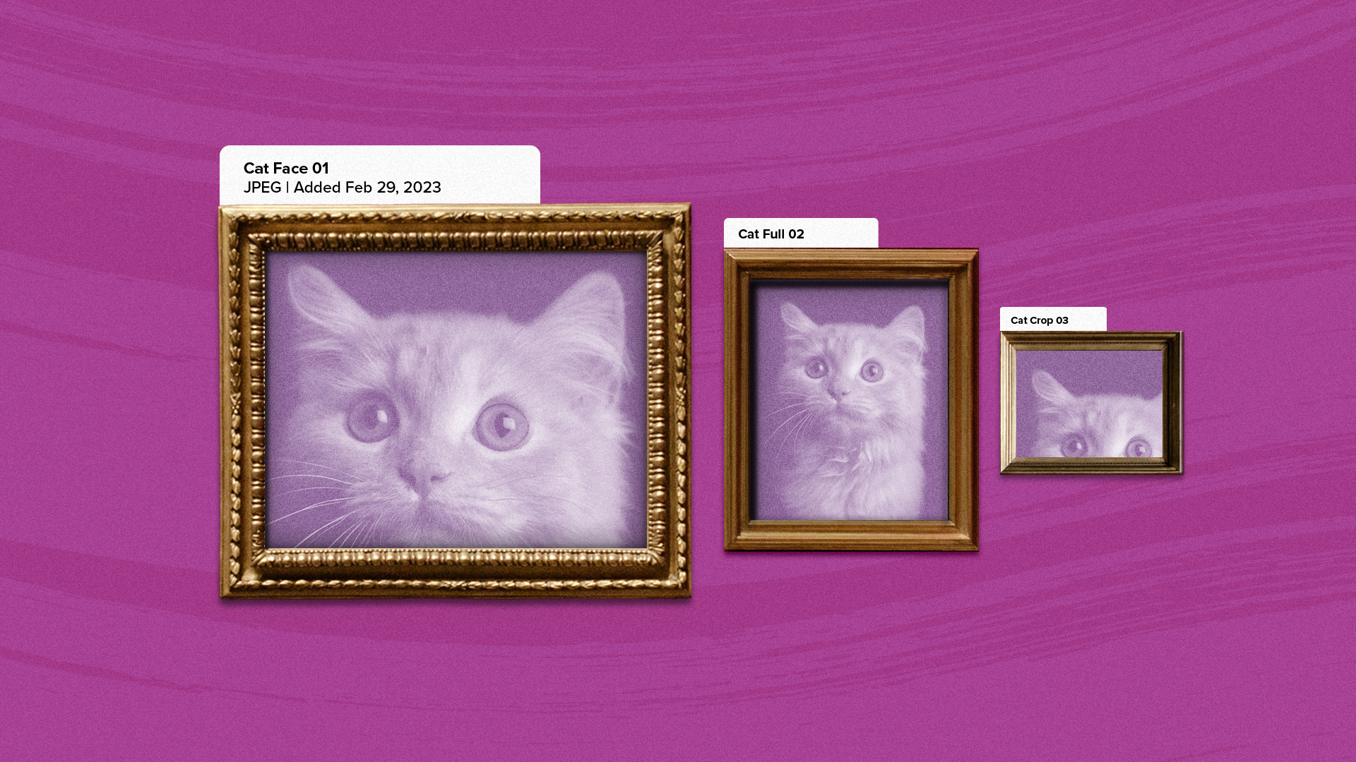
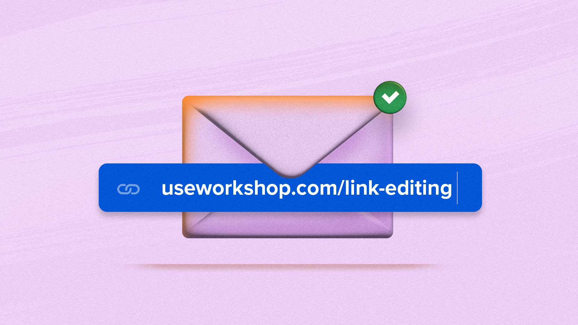
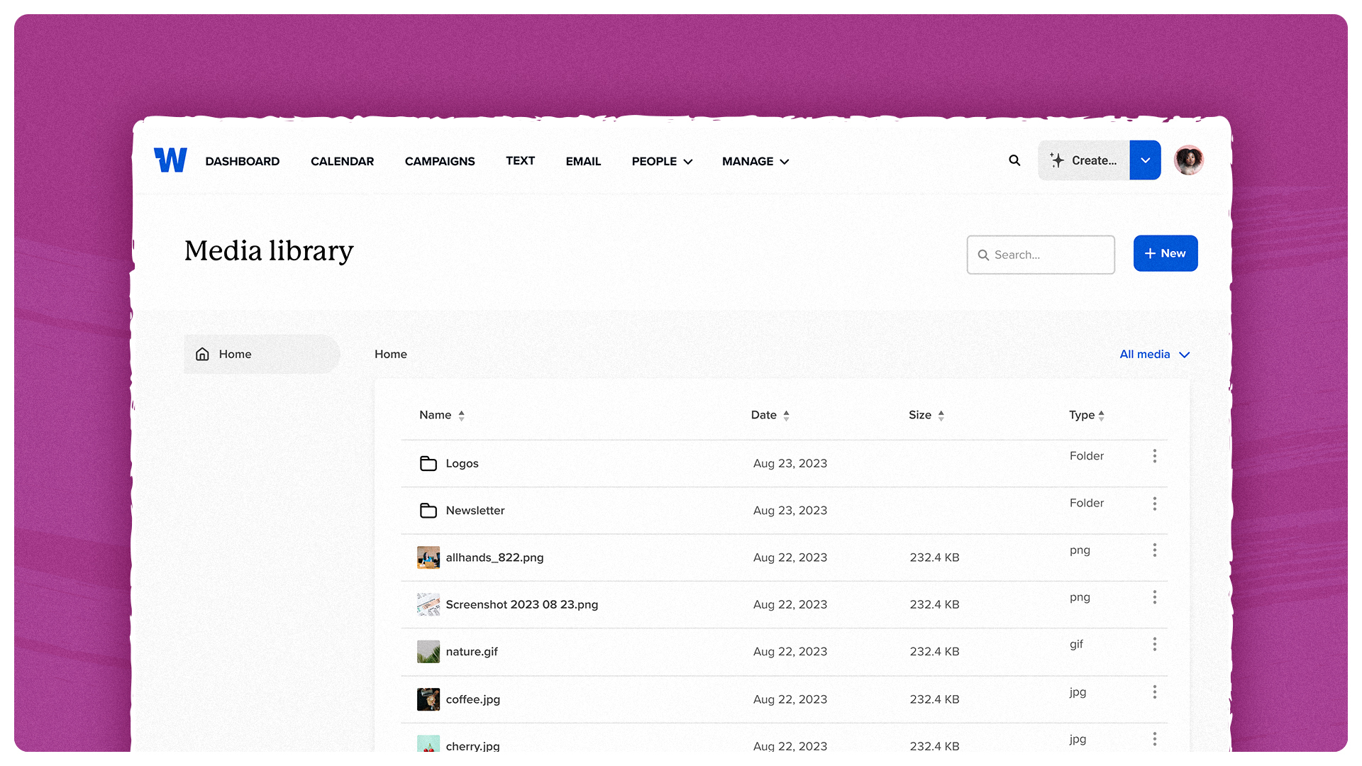
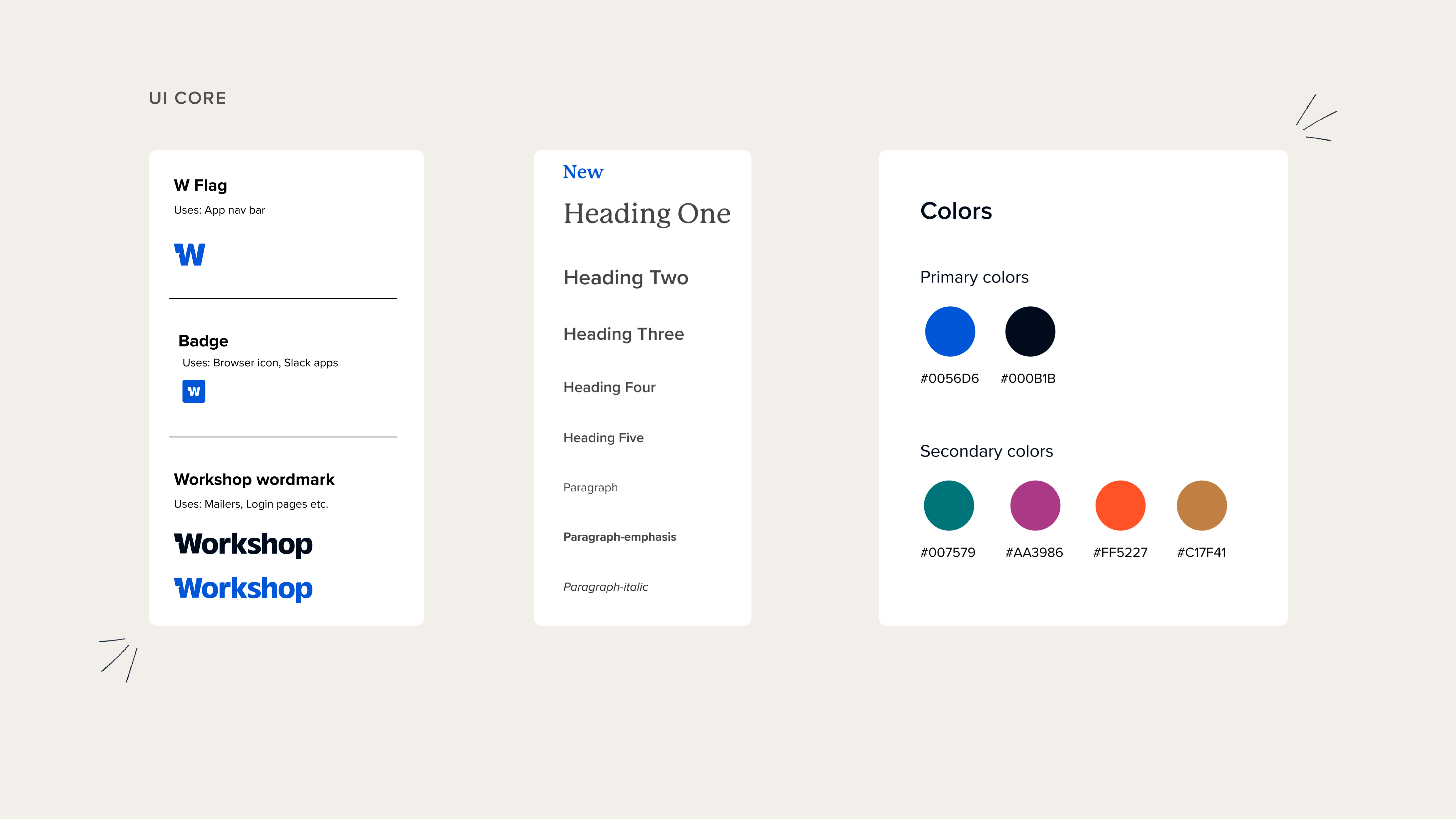 You’ll notice some major visual changes! We swapped logos, colors and fonts, giving the app a modern and sleek appearance. This is just the first pass at updating our app interface to align it with our new brand. Next steps will be adding in some more delightful elements, such as a new illustration style. We’re committed to continuously and iteratively refining the app to reflect our new brand identity!
Color palette updates and accessibility wins
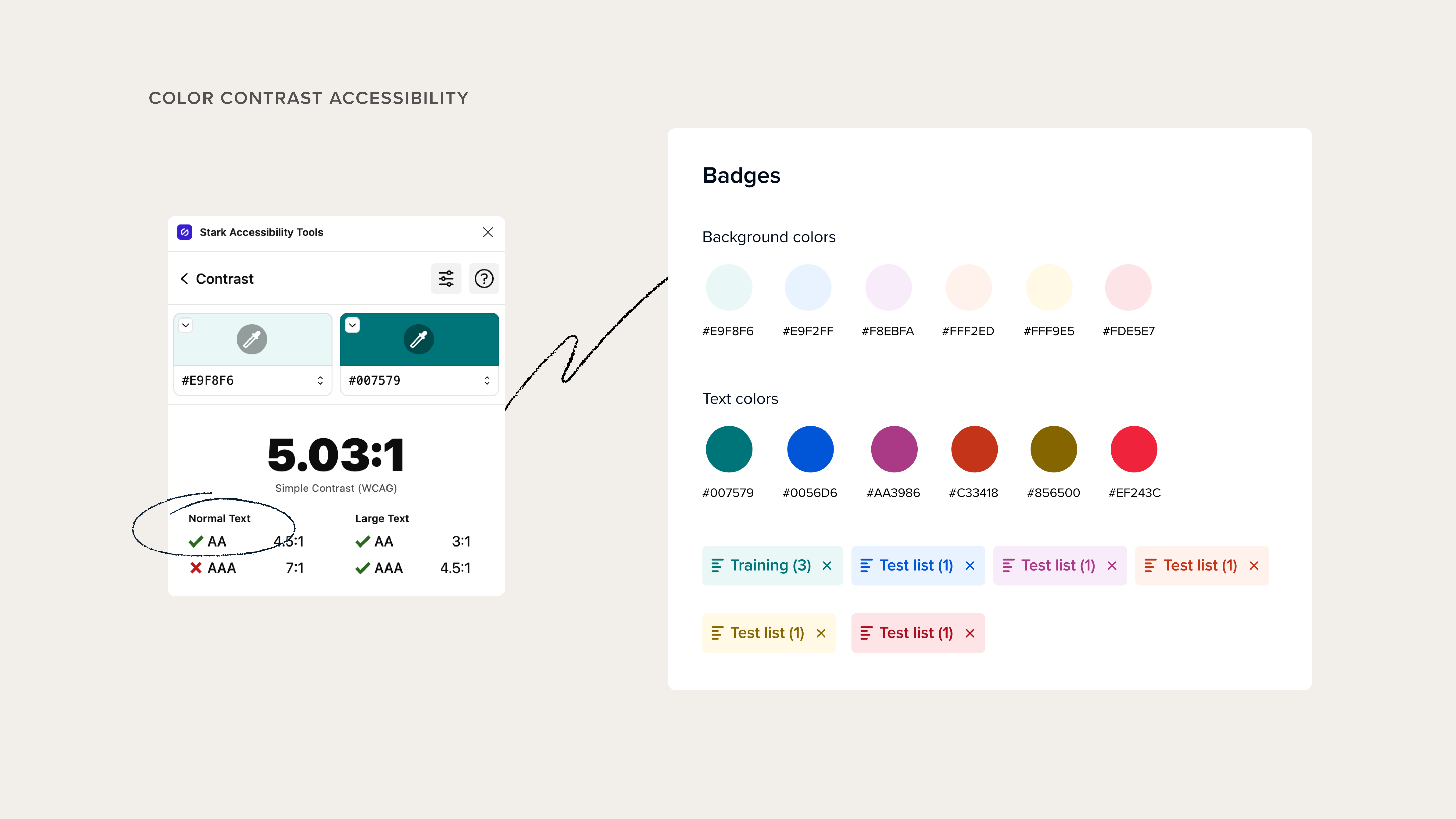 As part of our rebrand, we’ve updated our color palette in the app. But it’s not just about aesthetics—it’s about accessibility too. We adhere to the Web Content Accessibility Guidelines (WCAG) standards, which ensure that digital platforms are accessible to all users. We’ve rigorously tested our colors to pass the AA standards for color contrast ratios, making Workshop more inclusive and user-friendly for everyone.
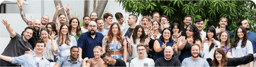
Working alongside marketing and defining the brand over the last several months has been a really fun time for us Workshoppers! It has given us time to truly reflect on who we are as a company, as a software service, and as a powerful tool that helps our customers connect and communicate with one another. We are more excited than ever to be on this journey with you all and we hope you love the brand new Workshop as much as we do.
Learn more about the values and thought process behind our rebrand!