


 Teams
Teams SharePoint
 Slack
Slack QR Codes
 PDF
PDF Active Directory
 Workday
 ADP
ADP Canva
CanvaShow the right content on the right device with device visibility

Some things look great on a big screen and cramped on a phone. A wide hero image, a multi-column layout, a detailed sign-off — sometimes you want it on desktop but not mobile, or the other way around. Now you can decide, block by block, exactly where your content shows up.
What you can do now
- Set any row, column, or content block to desktop only, mobile only, or both. You’re no longer designing one layout that has to work everywhere. Hide a wide image on mobile, show a compact version instead, or trim desktop-only details that crowd a small screen.
- Control it right where you’re building. Select the row, column, or block you want, open the Visibility tab, and under Hide block on choose your preference. That’s it — no separate mobile editor, no guesswork.
Where this shines
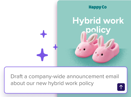
Picture an all-hands announcement with a big banner graphic that sings on desktop but eats half a phone screen. Set the full-size version to desktop only, drop in a tighter version for mobile only, and everyone gets a layout built for their screen. The same trick works for dense tables, multi-column sections, or any extra detail that’s helpful on a laptop and overwhelming on a phone.
Availability
Device visibility is live now in the modern editor. Select any row, column, or content block, head to the Visibility tab, and choose where it shows.